West Coast Witches
Original Illustrations, Logo Design, Visual Brand Identity & Packaging
West Coast Witches is a coffee company with the everyday witch and spiritual practice in mind. Influenced by Wiccan culture and sigil symbols, this coffee starts off your day with a blessing.

Goal & Design Solution
Inspired by growing up in a Wiccan household -- where ouija board sessions, crystal balls, and tarot cards were a normal occurrence, it was nice to design a brand that felt like home. I was taught and encouraged to create positive sigil symbols and spells, which I like to hide in my artwork. I thought it would be a fun experiment to overtly design it in. A lot of mystery and images of death are present in Wiccan culture. These are not meant to be scary, but as a normal part of life.
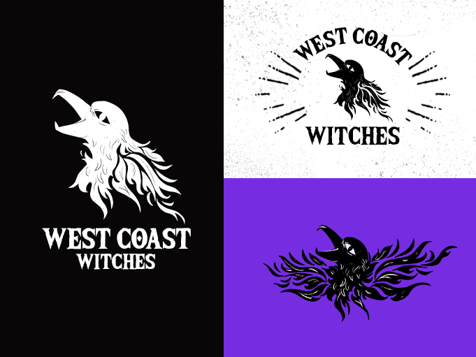
Create a Logo
Brand Identity
Business Card
Bag of a Light Roast, Medium Roast, and 2 bags of a Dark Roast
Bottle of Vanilla, Chocolate, and Unsweetened Black cold brew
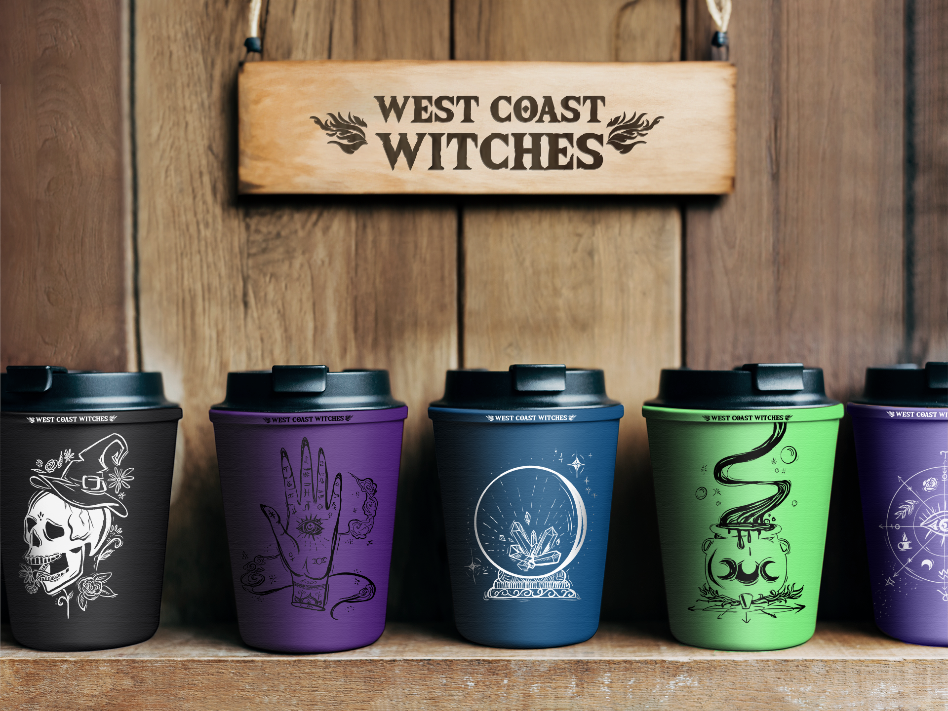
To-go Cup designs
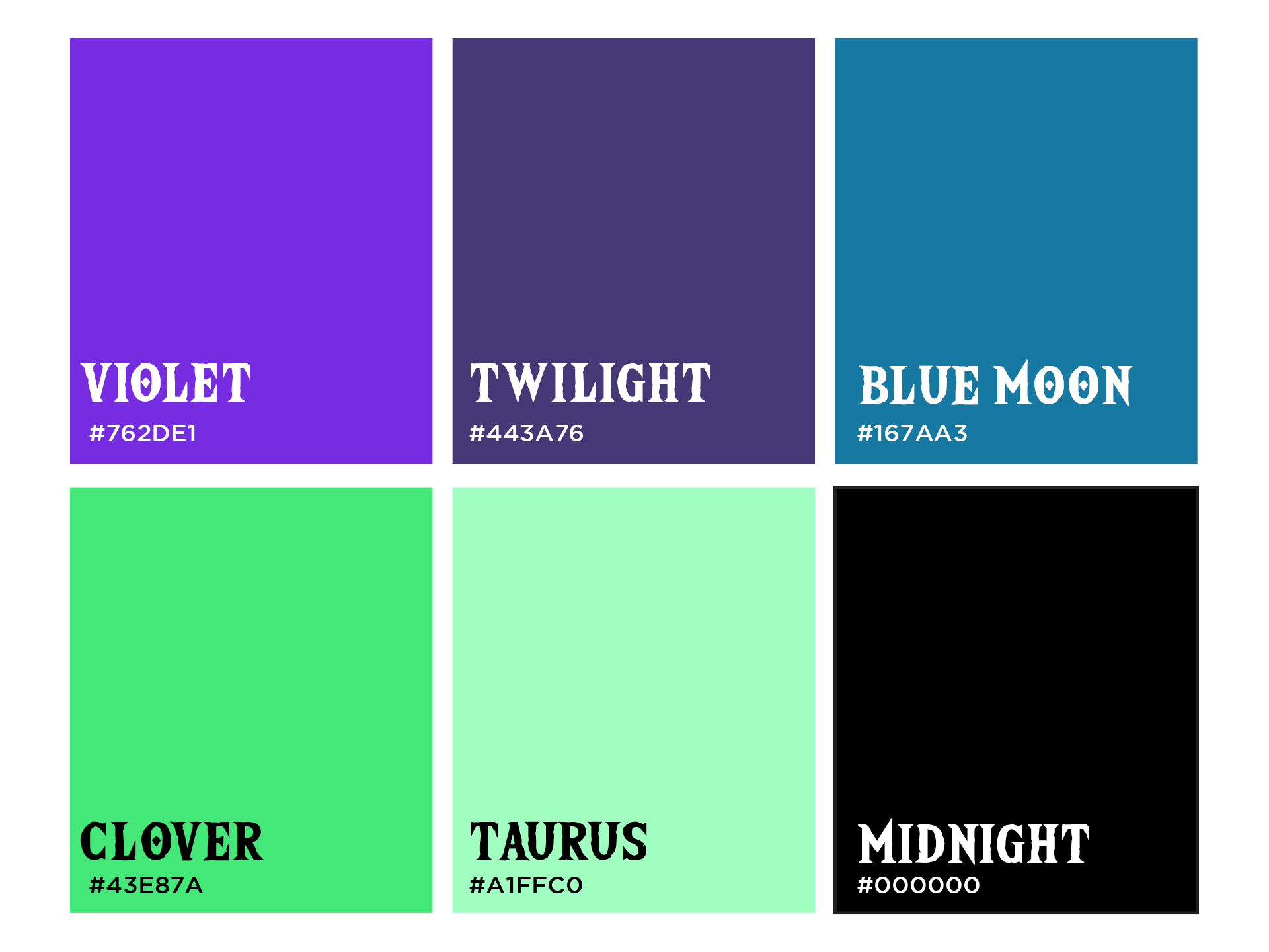
The colors were chosen from a limited cool palette range. With an attempt to modernize and refashion “Halloween” colors for everyday coffee.
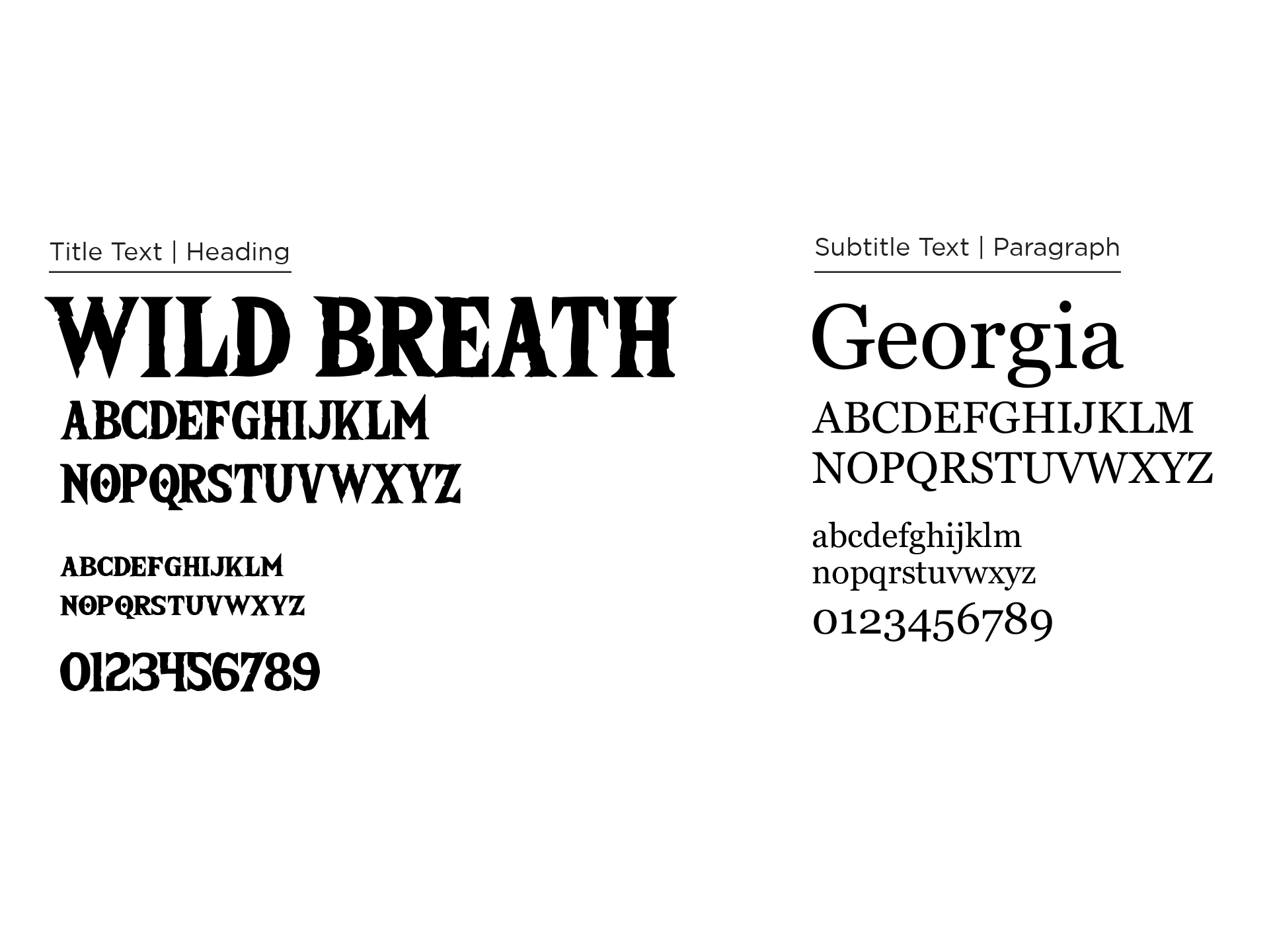
The typeface “Wild Breath” picked for it’s earthly texture and bilabial click (stylistic choice to have the letter “o” have a dot inside, ʘ) And “Georgia” was paired to contrast the very decorative typeface, for an accessible, easy-to-read serif font.
