Lesser Known Comics
Visual Brand Identity, Product Development, & Advertising
Lesser Known Comics is brand-new indie comic book publisher with writers and artists all over the U.S., Argentina, and Spain. The goal of the company is “making dope comic books and changing industry standards for how artists are treated.” As a the Marketing Director and Graphic Designer, it was a challenge to bring together a cohesive and distinctive look for over 20 unique artists.
The Goal:
There were so many different art styles that the Lesser Known Comics artist’s have that also needed to be showcased together. This was all while still maintaining a specific, cheeky attitude. The goal was to create pieces that were fun, stylistic, yet still clean.
Update the previous logo
Reformat original art for printing and merchandise
Format all of the books for printing
Create Book Covers
Create and design pitch decks for investors and in house presentations
Create ads for social media content
Design Solution
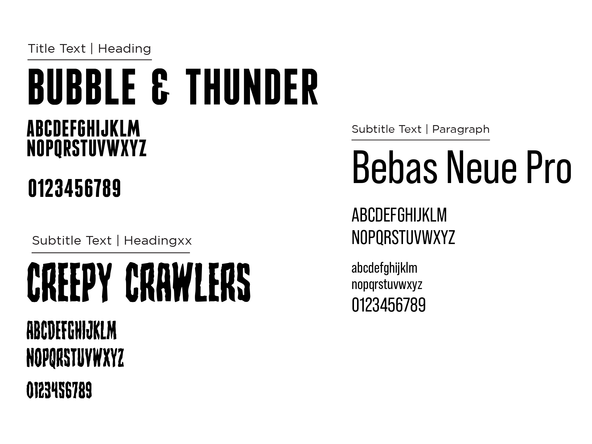
I went with colors that already fit the brand while utilizing the sketches of the comic art to overlay on black backgrounds. The sans-serif “Bebas” typography was used to be a loud attention getter. The typeface “Bubble and Thunder” were often used by the other artists so it incorporated well into the advertising. “Creepy Crawlers” communicated the unusual, creepy storylines of the comics. The products and social media content were artwork from the panels of the comic books. The artwork was sometimes recolored and then repurposed into merchandise.


